

One “Insignificant” Change = 400% Increase in Website Conversions

One “Insignificant” Change = 400% Increase in Website Conversions

It’s late at night when you step into your dark bedroom.

You flick the light switch on and…

Nothing happens.

You flick it again.

*click click*

*click click*

*CLICK CLICK CLICK CLICK!!!*

Nothing.

Over your lifetime, I doubt you’ve spent much time thinking about light switches.

But sometimes they don’t work and suddenly you’re consumed with a compounding problem…

You’ve got to put in a new lightbulb (which you definitely don’t have in the house) while standing on a tipsy step-stool in the dark and holding a flashlight with your mouth.

This situation is similar to how people act on your website.

Usually nobody comments on it or notices it. Your website just sits there.

Functioning. Helping visitors efficiently fulfill some purpose. Doing a great great job and being hella boring like a light switch.

But people think this isn’t fancy enough. So they add all sorts of unnecessary fluff to their sites to “grab attention”:

  • Animations
  • Fade-ins, fade-outs
  • 27 different fonts 😵‍💫
  • Every paint-chip color in Home Depot
  • Cutesy navigation

These things do grab attention, yes. But in the same way a broken light switch does.

*click click click!*

The immediate result is:

  1. Your visitor gets physically & emotionally distracted from why they’re on your site in the first place.
  2. Your sales die a hasty death. 💀

So, what to do?

First, do nothing.
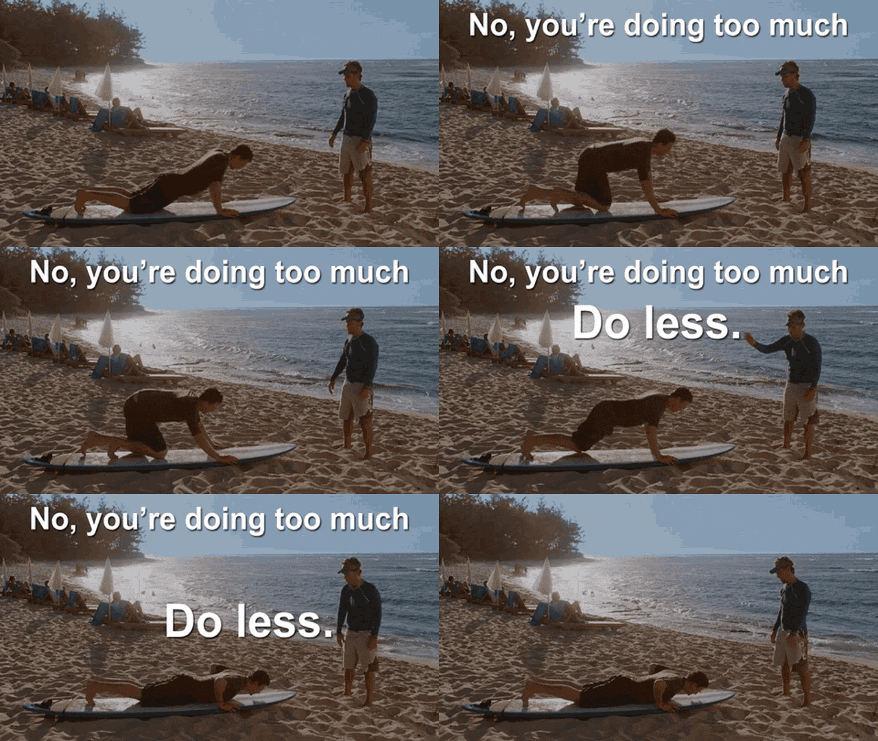
Don’t redesign your site. Don’t change your entire marketing plan. Don’t question your existence or worth. Trust me, you’re amazing.

Don’t do any of that stuff.

For now, just look. An entire marketing plan might fail because one of stupid link. But first you gotta look to find it.

I recently did this with a client…here’s shortest Case Study you’ve ever seen:

Client had tons of traffic but people weren’t visiting his online Shop.

Why not? Well his navigation menu didn’t say “Shop”. It said “Get Stuff.”

But he didn’t want to change it. He felt it would be insignificant and also liked the friendliness of “Get Stuff”.

I tell him, “Well, let’s give it a shot.”

So we changed “Get Stuff” to “Shop”. The conversions on his website went up 400% literally overnight. Soon thereafter the site got acquired.

🛠️ So…action item:

When’s the last time you audited your site?

Look it over & check stuff:

  • Navigation – Is it perfectly clear? (“Services” is boring but better than “I Got Skills Yo”.)
  • Sign-up and checkout forms – Are you using as few input boxes as possible? Do you really need to ask for that phone number and zip code? (Every added box can reduce conversions.)
  • Typography – Use two legible fonts. Maximum three if you really need ‘em.
  • Underline only your links – Use bold and italics instead. You’d be surprised how often people click underlined words only to discover they’re not links. They feel ridiculed and then leave. (Jeez, so sensitive.)
  • Buttons – Do they work? Are they highly visible? Reserve one, contrasting color and use it only for buttons and important calls-to-action.
  • Animations – Are things fading in or moving around so much they’re making people seasick? (Yes, that’s actually a very common complaint from usability studies.)

If you ever get curious, ask someone to visit your site for the first time. Then sit back and watch them.

Nodding and/or spending money = good.

Frowns and/or vomiting = bad.

There’s probably no better way to end this email, so that’s all for this week.

But one quick question before I leave you:

What’s ONE thing on your site you think you could improve…even if you’re not sure how. (Send me a link & I’d be happy to peek at it.)

Thanks very much for reading!


PS. Shoutout of the week to Christine Trac on Twitter. She’s been on me like hot mustard on a chicken nugget to get this newsletter out. Give her a follow. She’s smart, spicy, and incredible with email deliverability.

Image by starline on Freepik

MY FREE NEWSLETTER

Get the exact tips & strategies I use in my own business & with all my clients

Learn my simple, repeatable process for productizing your knowledge, creating digital products & courses that sell like crazy, and earning semi-passive revenue. 

Enjoy this post? Please share!

One “Insignificant” Change = 400% Increase in Website Conversions

One “Insignificant” Change = 400% Increase in Website Conversions

It’s late at night when you step into your dark bedroom.

You flick the light switch on and…

Nothing happens.

You flick it again.

*click click*

*click click*

*CLICK CLICK CLICK CLICK!!!*

Nothing.

Over your lifetime, I doubt you’ve spent much time thinking about light switches.

But sometimes they don’t work and suddenly you’re consumed with a compounding problem…

You’ve got to put in a new lightbulb (which you definitely don’t have in the house) while standing on a tipsy step-stool in the dark and holding a flashlight with your mouth.

This situation is similar to how people act on your website.

Usually nobody comments on it or notices it. Your website just sits there.

Functioning. Helping visitors efficiently fulfill some purpose. Doing a great great job and being hella boring like a light switch.

But people think this isn’t fancy enough. So they add all sorts of unnecessary fluff to their sites to “grab attention”:

  • Animations
  • Fade-ins, fade-outs
  • 27 different fonts 😵‍💫
  • Every paint-chip color in Home Depot
  • Cutesy navigation

These things do grab attention, yes. But in the same way a broken light switch does.

*click click click!*

The immediate result is:

  1. Your visitor gets physically & emotionally distracted from why they’re on your site in the first place.
  2. Your sales die a hasty death. 💀

So, what to do?

First, do nothing.

Don’t redesign your site. Don’t change your entire marketing plan. Don’t question your existence or worth. Trust me, you’re amazing.

Don’t do any of that stuff.

For now, just look. An entire marketing plan might fail because one of stupid link. But first you gotta look to find it.

I recently did this with a client…here’s shortest Case Study you’ve ever seen:

Client had tons of traffic but people weren’t visiting his online Shop.

Why not? Well his navigation menu didn’t say “Shop”. It said “Get Stuff.”

But he didn’t want to change it. He felt it would be insignificant and also liked the friendliness of “Get Stuff”.

I tell him, “Well, let’s give it a shot.”

So we changed “Get Stuff” to “Shop”. The conversions on his website went up 400% literally overnight. Soon thereafter the site got acquired.

🛠️ So…action item:

When’s the last time you audited your site?

Look it over & check stuff:

  • Navigation – Is it perfectly clear? (“Services” is boring but better than “I Got Skills Yo”.)
  • Sign-up and checkout forms – Are you using as few input boxes as possible? Do you really need to ask for that phone number and zip code? (Every added box can reduce conversions.)
  • Typography – Use two legible fonts. Maximum three if you really need ‘em.
  • Underline only your links – Use bold and italics instead. You’d be surprised how often people click underlined words only to discover they’re not links. They feel ridiculed and then leave. (Jeez, so sensitive.)
  • Buttons – Do they work? Are they highly visible? Reserve one, contrasting color and use it only for buttons and important calls-to-action.
  • Animations – Are things fading in or moving around so much they’re making people seasick? (Yes, that’s actually a very common complaint from usability studies.)

If you ever get curious, ask someone to visit your site for the first time. Then sit back and watch them.

Nodding and/or spending money = good.

Frowns and/or vomiting = bad.

There’s probably no better way to end this email, so that’s all for this week.

But one quick question before I leave you:

What’s ONE thing on your site you think you could improve…even if you’re not sure how. (Send me a link & I’d be happy to peek at it.)

Thanks very much for reading!


PS. Shoutout of the week to Christine Trac on Twitter. She’s been on me like hot mustard on a chicken nugget to get this newsletter out. Give her a follow. She’s smart, spicy, and incredible with email deliverability.

Image by starline on Freepik

MY FREE NEWSLETTER

Get the exact tips & strategies I use in my own business & with all my clients

Learn my simple, repeatable process for productizing your knowledge, creating digital products & courses that sell like crazy, and earning semi-passive revenue. 

Enjoy this post? Please share!

Sign up below & let's do this!

Enter your best email address below and hit the big red button.

    No spam. Ever. Your info will not be sold, lost, loaned, or given to pirates. You can unsubscribe at any time.